SPLYN case study
Find the right brand. Build the future shelf.
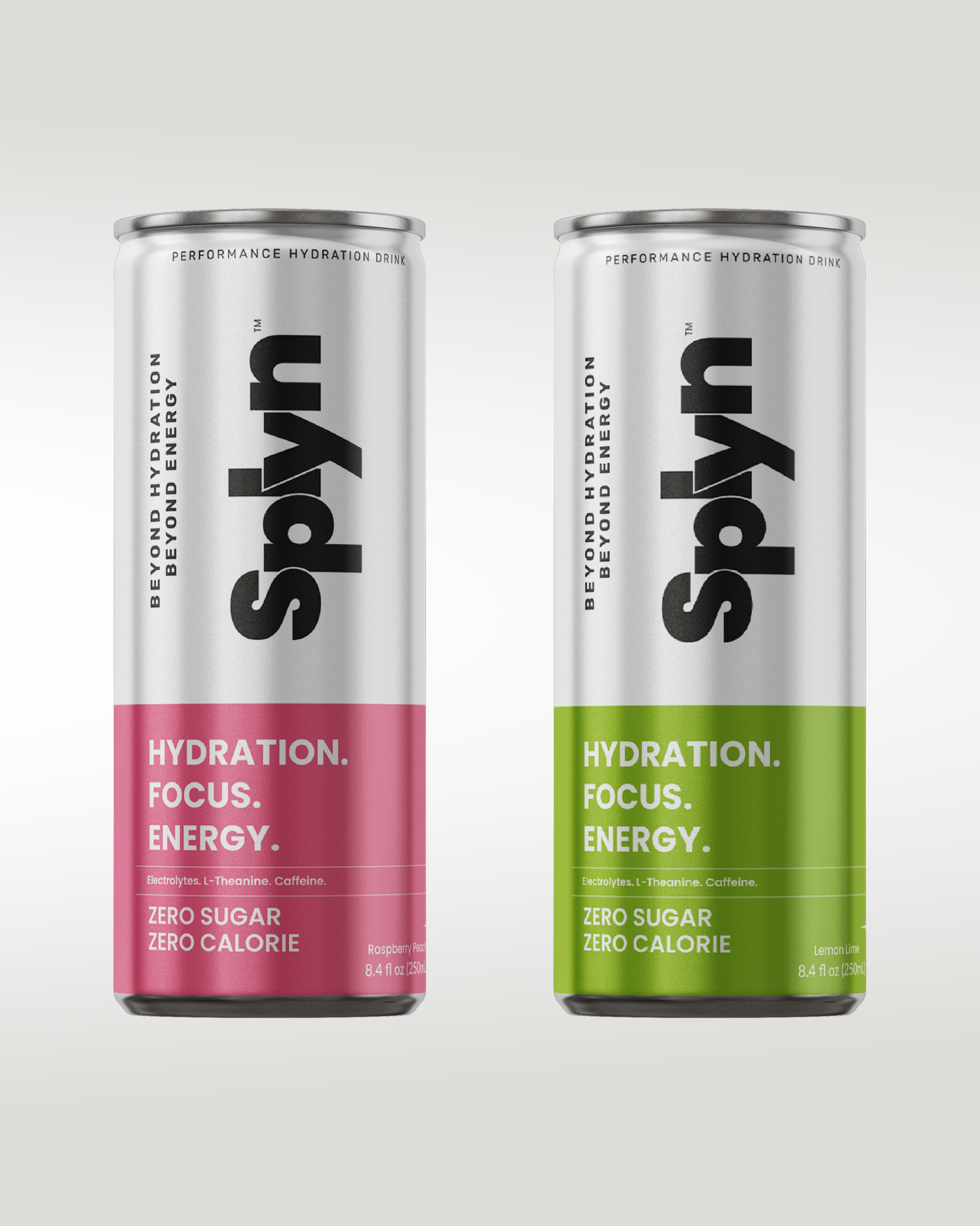
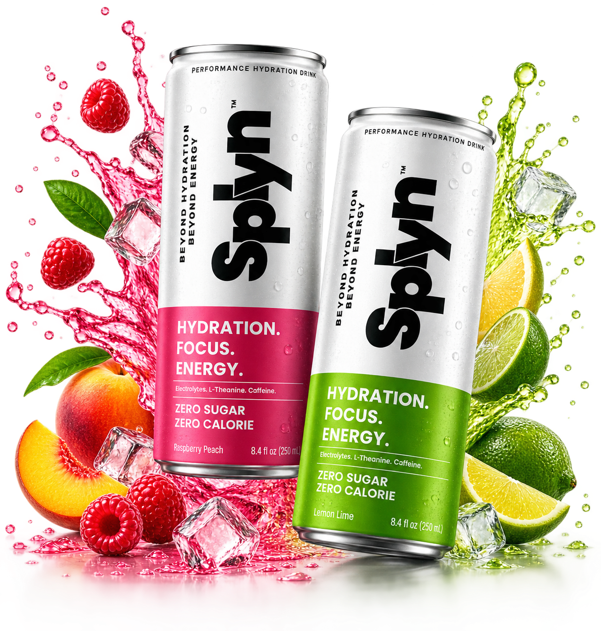
SPLYN is a performance hydration brand created to bring hydration, focus and energy together in one distinctive product. We developed the brand identity and packaging to give SPLYN a confident presence, clear communication and a visual system built for growth.
Project Oerview
Building a bold identity for modern hydration.
SPLYN needed a visual identity that could communicate performance while feeling fresh, modern and distinctive. The project focused on creating a recognisable brand language that could work across multiple flavours and future product extensions.
- Create a clear visual direction for a new performance hydration brand.
- Develop a memorable identity capable of standing apart from category competitors.
- Develop a colour and design system that could adapt across product variants.
- Translate the identity into packaging designed to attract attention and remain recognisable.
The SPLYN Story
From idea to shelf-ready identity.
Research
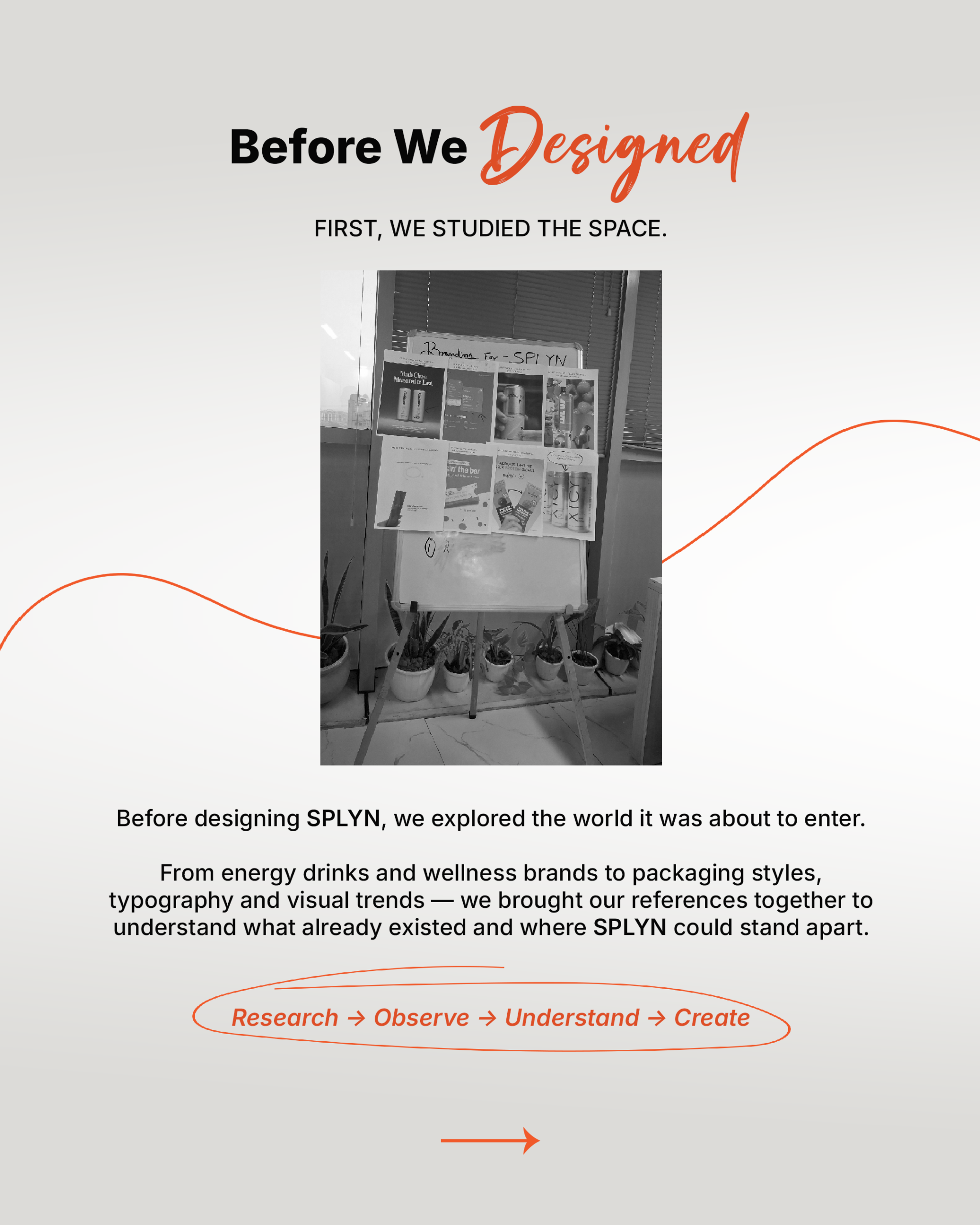
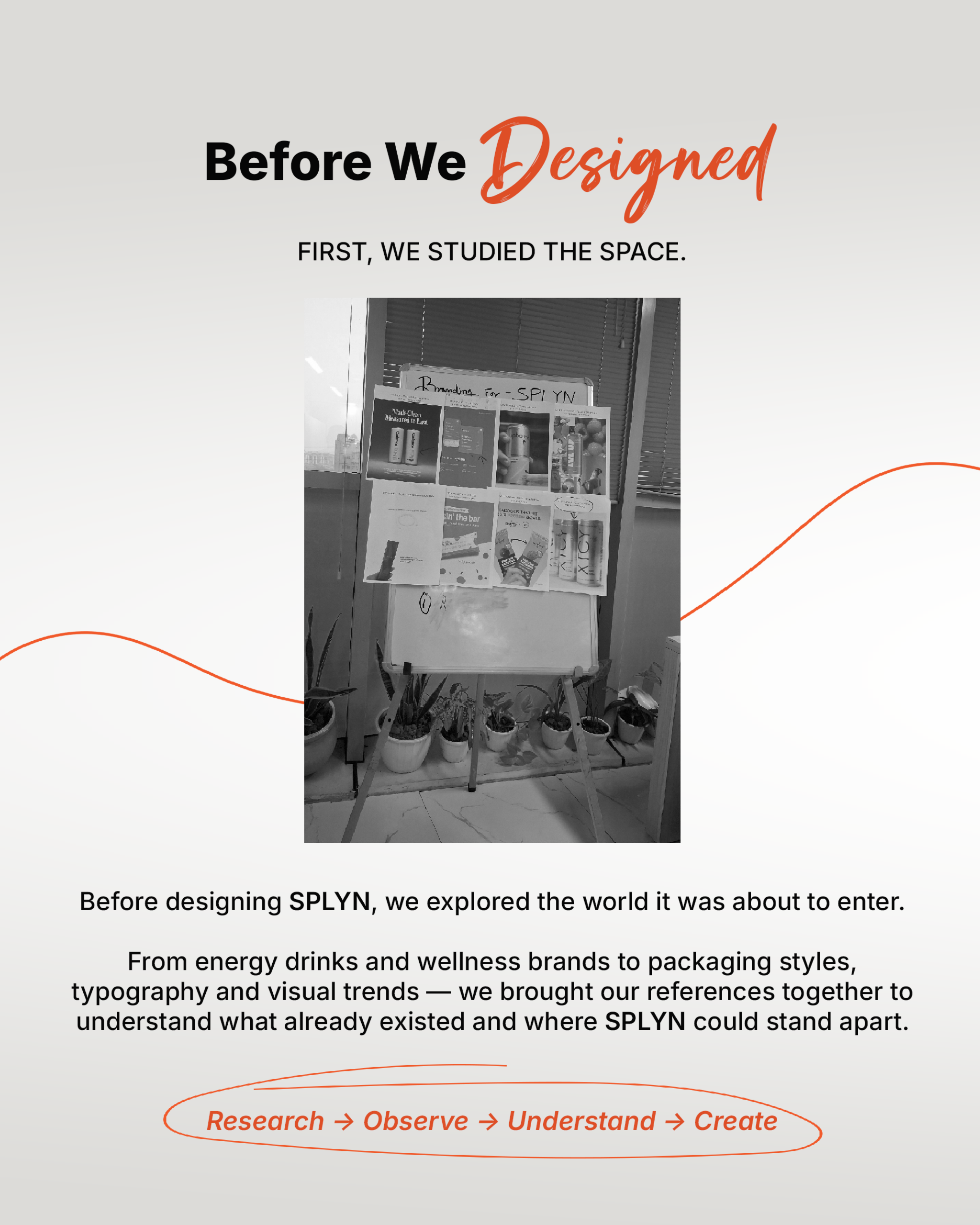
First, we studied the space.
We explored the hydration, energy and wellness categories to understand competitor behaviour, packaging conventions, typography and visual trends. This research helped identify where SPLYN could create a more distinctive presence.

Direction
Rough ideas became sharper directions.
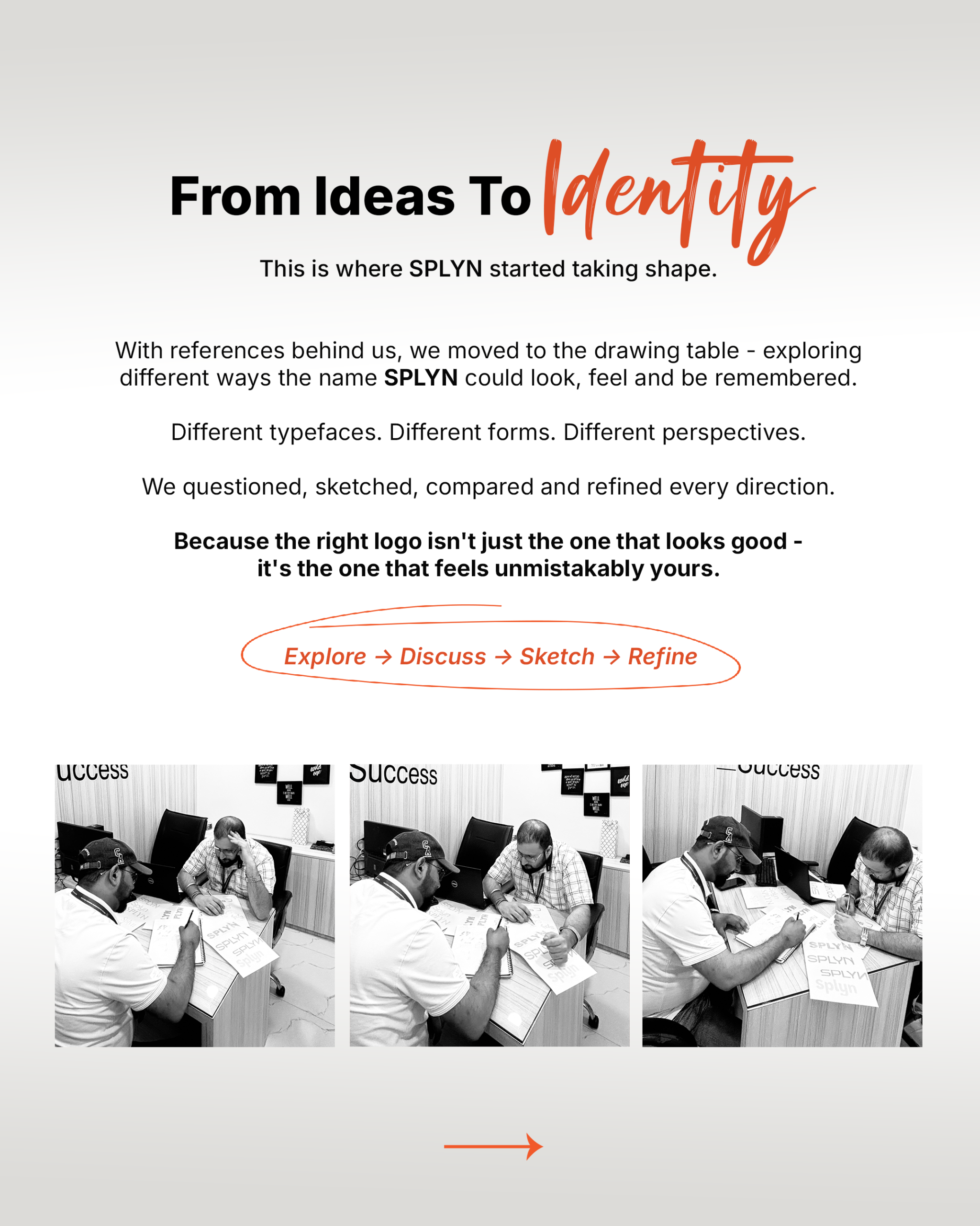
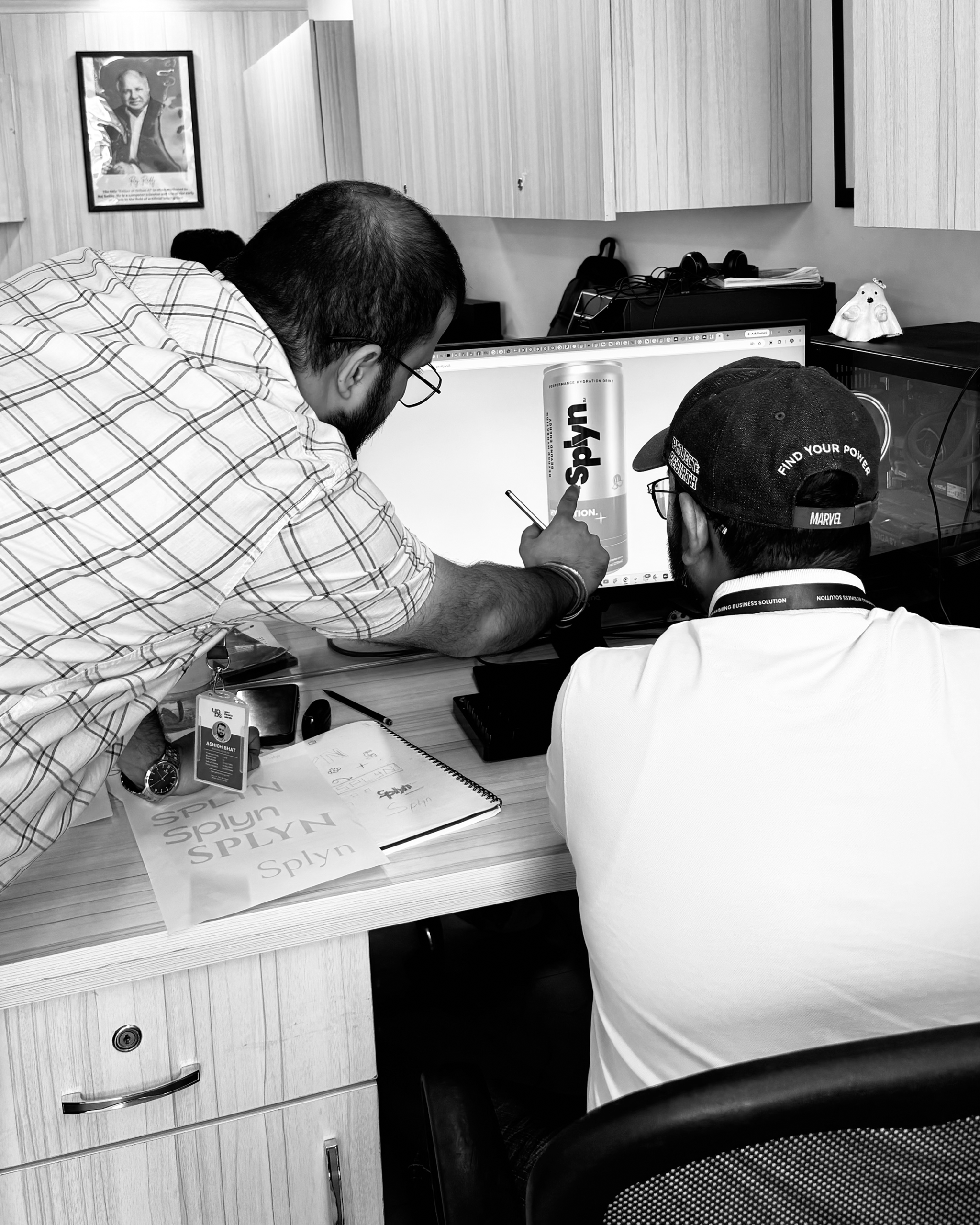
Early concepts, sketches and team discussions helped us test different visual routes. Through review and refinement, the strongest ideas developed into a focused creative direction for the brand.
Identity
The brand found its character.
Typography, colour, composition and graphic details were brought together to establish SPLYN's visual language. The result was a confident identity designed to feel energetic without becoming visually complicated.
Packaging
The identity moved onto the can.
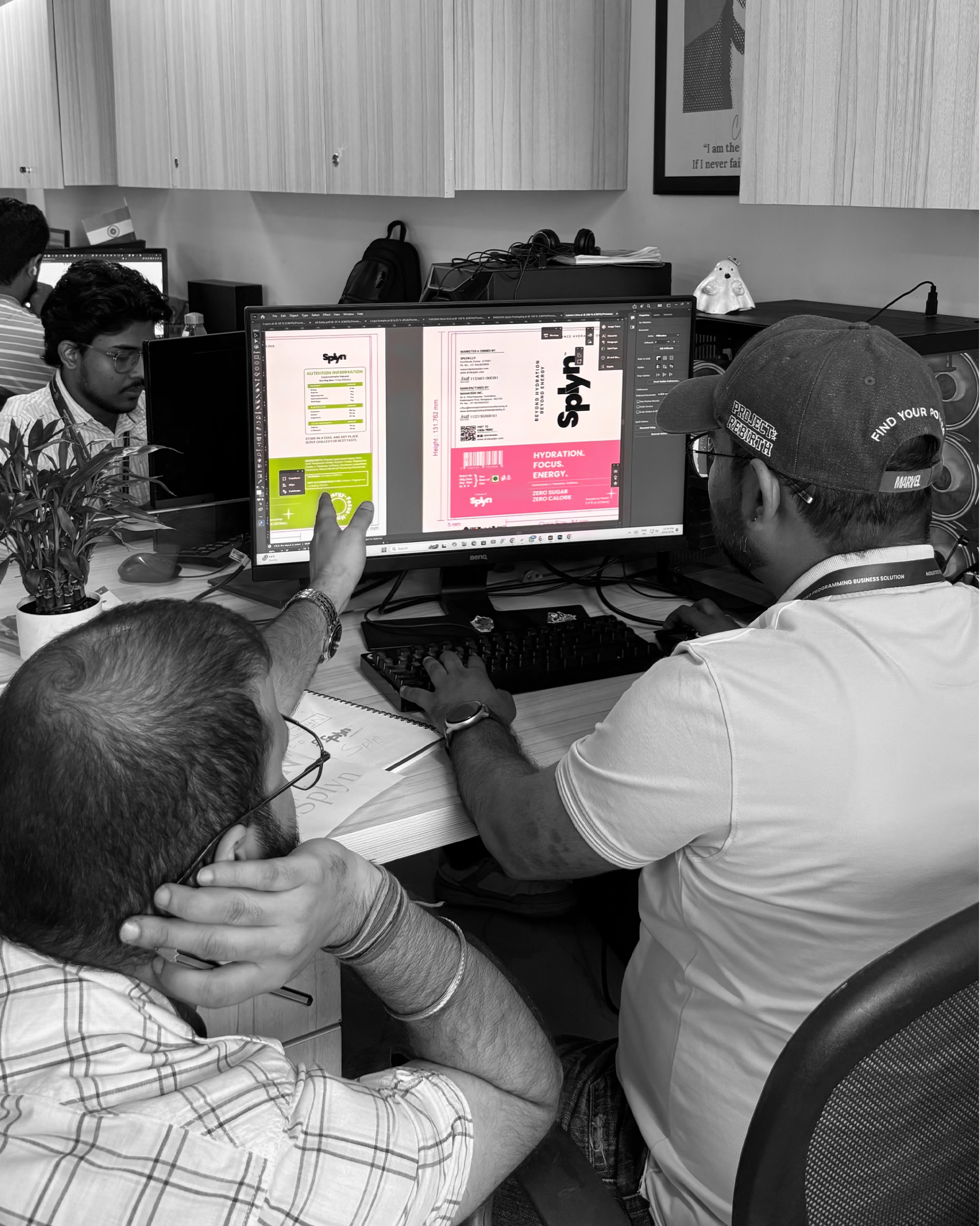
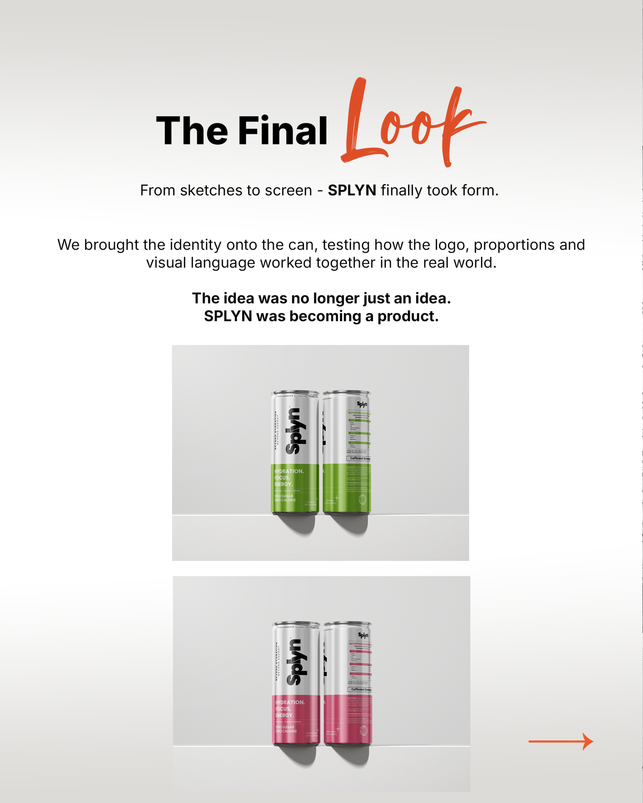
The new visual system was translated into packaging with a clear hierarchy and distinctive flavour treatment. Each can remains part of the same brand family while having enough individuality to stand on its own.
The Challenge
Give a new drink brand the confidence to enter a crowded market.
SPLYN was entering a category filled with established visual conventions and competing messages. The challenge was to create something that could communicate its benefits quickly while giving the brand a personality of its own.
Stand Out
Create a distinctive identity that feels different from the category clutter.
Communicate
Clearly express hydration, focus and energy through a simple visual language.
Stay Flexible
Build a system strong enough to work across flavours, formats and future products.
Goals & Deliverables
What the brand system needed to solve.
Create recall
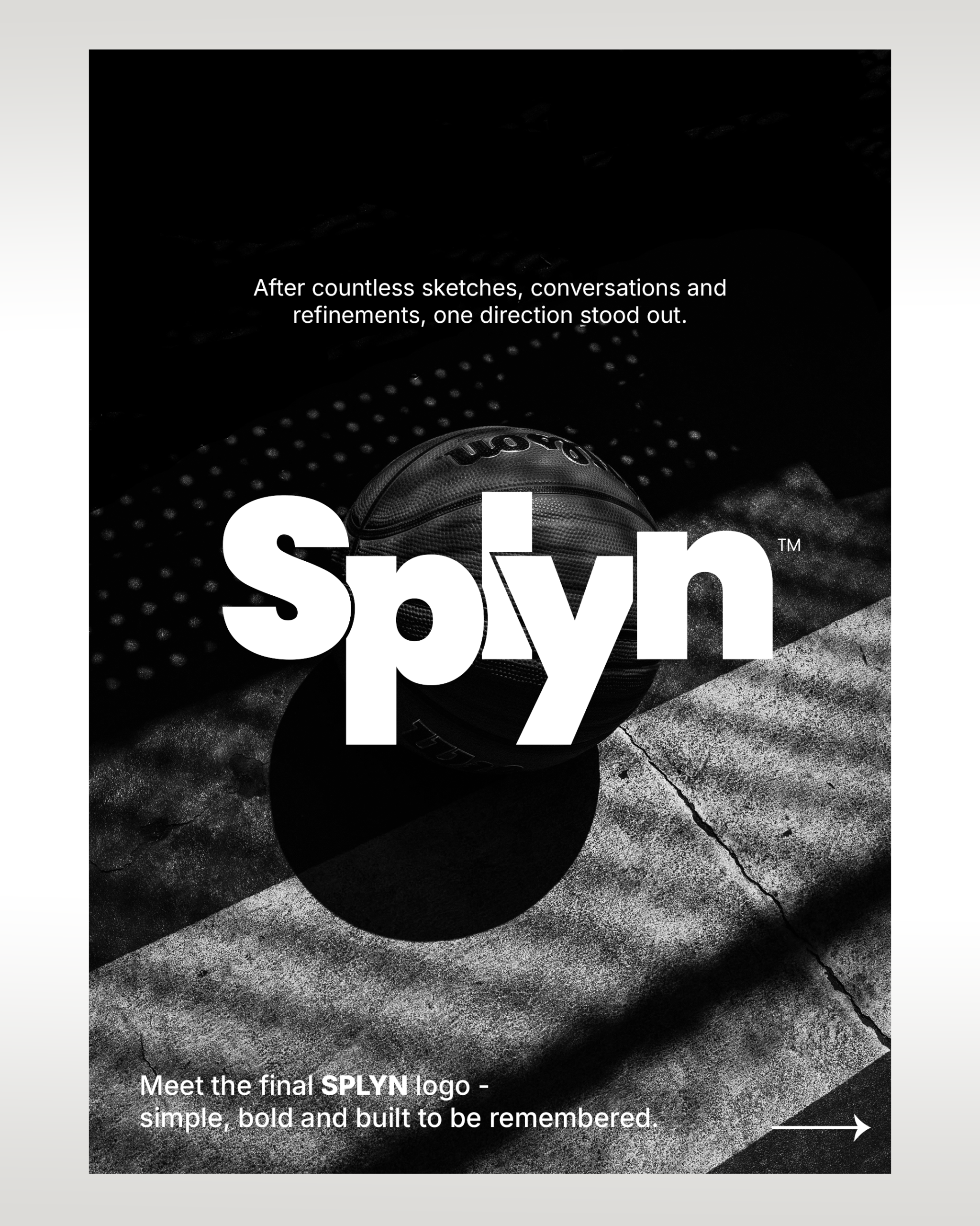
Build a strong wordmark that could be remembered quickly in a crowded beverage category.
Clarify the promise
Make hydration, focus, energy, zero sugar, and zero calorie easy to notice on pack.
Build the Range
Create a consistent framework capable of supporting multiple flavours and variants.
Prepare for Growth
Develop a visual foundation that could extend beyond the initial packaging range.
Visual Identity
A visual language with energy and clarity.
Identity
The brand took shape.
SPLYN's identity combines strong typography, confident composition and a focused colour palette to create a visual presence that feels energetic, contemporary and recognisable.
Performance Silver
#E7E5DF
Raspberry Peach
#F17292
Lemon Lime
#8EC240
Font Used
Heavy display type with clean supporting text
A bold display style gives the brand its visual impact, while a clean supporting typeface keeps product information readable and organised.
Display
Poppins
Body
Roboto/Rubik
Design Process
Research, observe, understand, create.
Research
Competitor analysis, category research and visual exploration helped establish the creative territory for SPLYN.
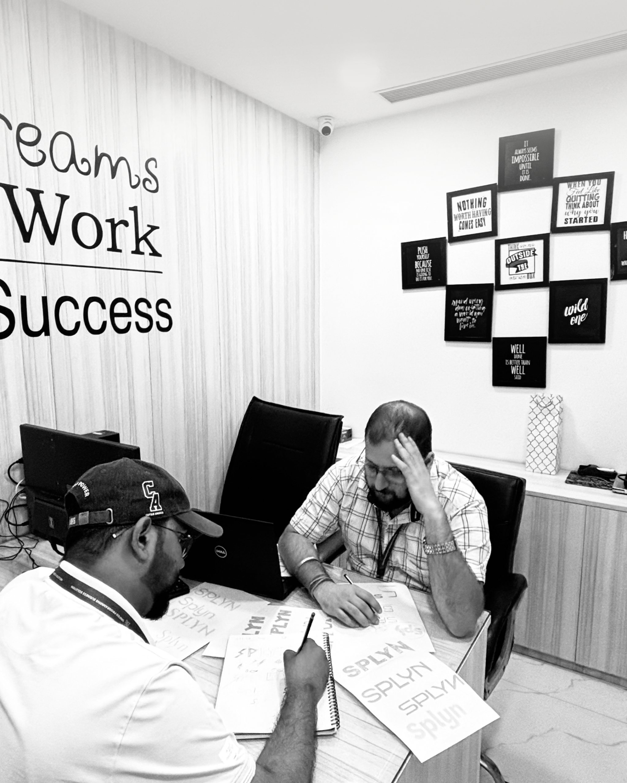
Sketch
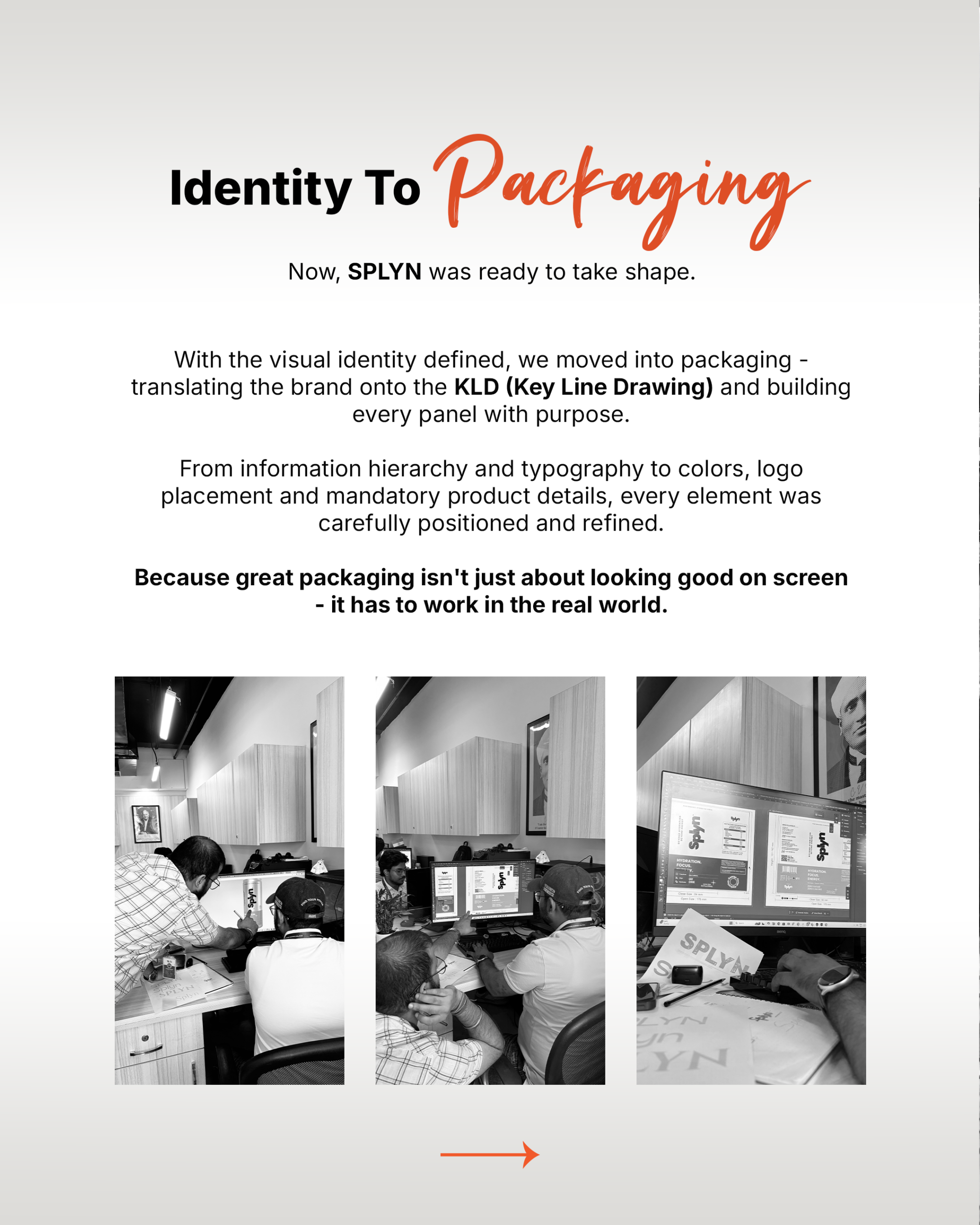
Typography, layouts, colour combinations and packaging ideas were explored to discover the strongest visual possibilities.
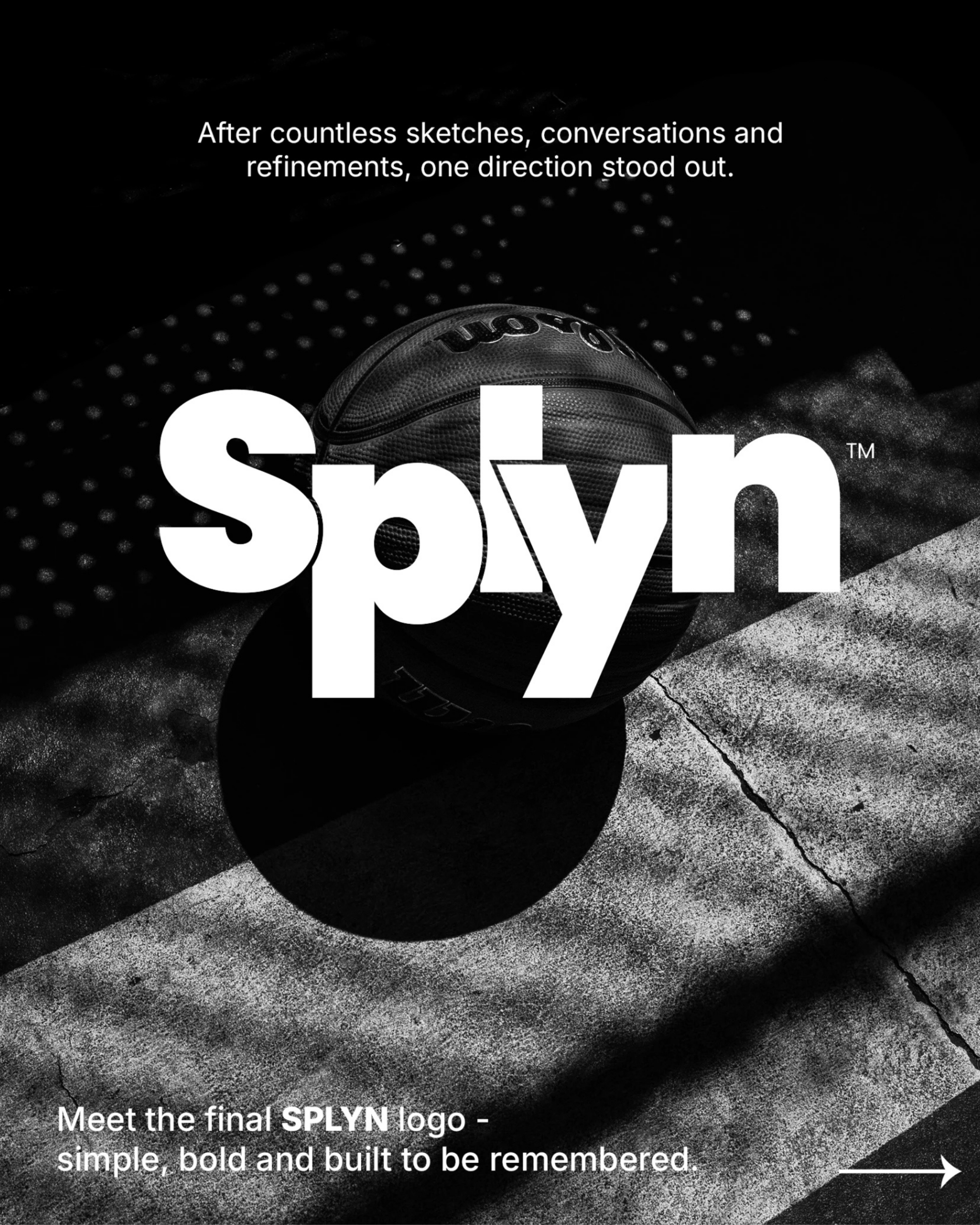
Refine
The strongest direction was developed into a focused identity with greater clarity, consistency and shelf impact.
Let's Build What's Next
Have a product idea worth bringing to life?
From the first conversation to the final package, we help turn ambitious product ideas into clear, compelling brands. SPYLN is one example of how strategy, identity and packaging can come together to create a product ready for the real world.
The Result
A brand system designed to move forward.
Custom Identity
A visual identity created specifically around the SPYLN brand.
Launch Flavours
Raspberry Peach and Lemon Lime brought together under one system.
Clear Promise
Hydration. Focus. Energy.
Future Extensions
A flexible identity built for new flavours, formats and touchpoints.
Source Journey
See how SPLYN came together.
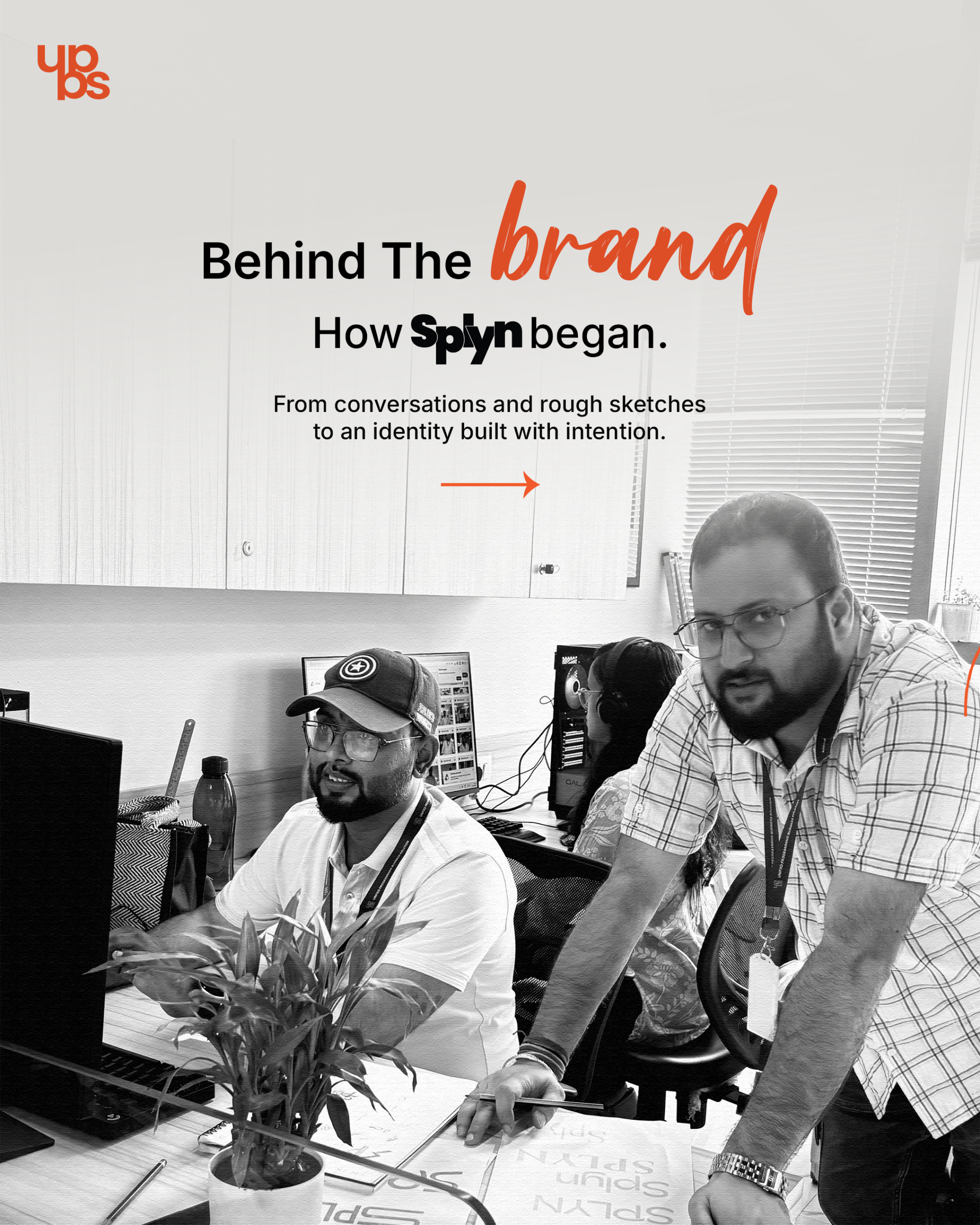
Explore the research, sketches, design development and final packaging that shaped the SPLYN identity.